
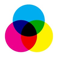
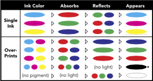
Colour Harmony
Color harmony refers to the most favorable colour mixed together to create a balanced & visually ? pleasing design. This helps to create an aesthetically sound design which helps the viewers to feel calm & pleased. The colour balance is important as the perception about a product such as a website or an app is already made by its first look. Colour can be a major influence.
Techniques to Create Colour Harmony
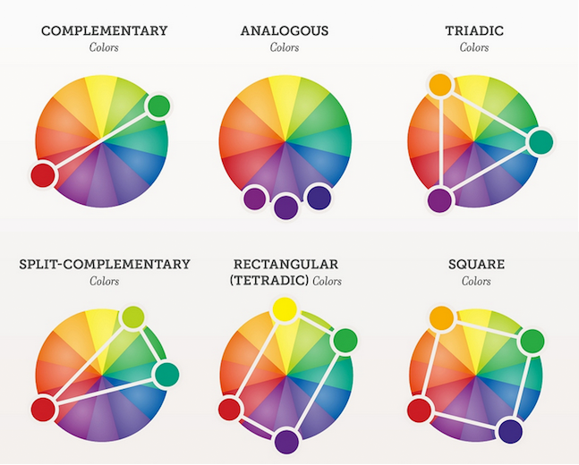
1) Complementary Colours
Colours that are opposite to each other on the Colour Wheel are known as complementary colours. (e.g. Red & Green). These high contrasting colours create vibrant looks which need to be used cautiously, else the designs could be very flashy in an unpleasant manner.
2) Monochromatic Colours
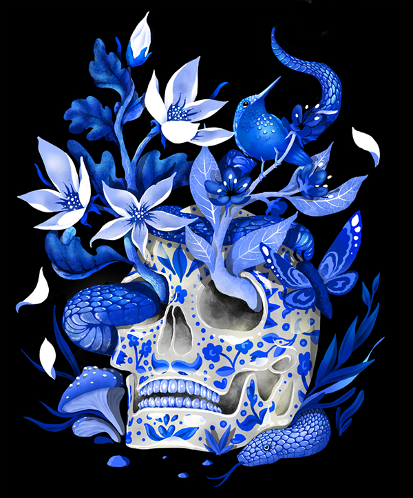
Monochromatic colour includes various tones & shades of a single colour. These are generally used to create the shadows of an object. For instance; a range of blues in its lighter & darker shades. This is a safe choice & generally, you don?t go wrong with this.
3) Analogous Colours
This includes the adjacent colours of the Colour Wheel. This creates the perfect color harmony where no contrast is needed & the images can blend with the background.

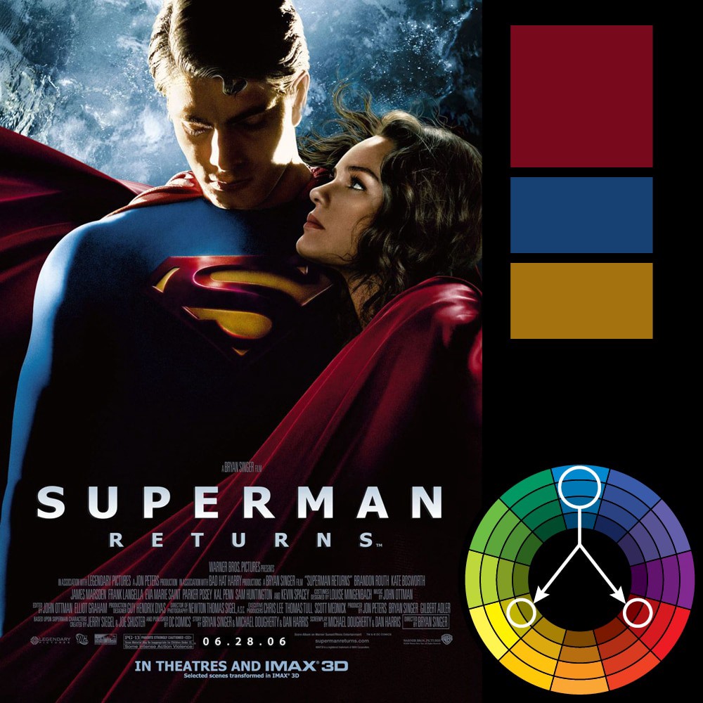
4) Split-Complementary Colours
This scheme works well when you need to show the contrast while it is not as jarring as the complementary colour scheme. E.g. if you choose the colour blue, then split-complementary colour would involve the adjacent colours of the complementary colour of blue, (i.e. red & yellow).
5) Triadic Colors
When the design needs more colour, a tridiac scheme could be chosen. This includes any three colours equidistant at the colour wheel. But make sure to use any one of the colours as a dominant & the rest two as the accents.
6) Tetradiac (Rectangular Colours)
This is the most complex scheme & is most suitable for experienced designers. This include four colours from the colour wheel which are complementary pairs. It is difficult to crack but if used correctly, the results would be stunning.

7) Square Colours
This is similar to the rectangular colour scheme, but with all colours spaced evenly around the coloured circle. This scheme offers the maximum combinations, hence should be carefully used.

Conclusion
It is very important to understand these basics thoroughly before one starts with the process of designing. The design could be exceptional but unless you get the colours right, it would fail the purpose of attracting the viewers. Therefore, one should pay attention to the colour scheme they want to follow for their design & should try to choose the colour palette with the help of the Colour Wheel.