Recently, I was fortunate enough to speak at HubSpot?s First Gen in Tech event where I had the chance to talk about what a Product Designer is and what they do at HubSpot. The event was extremely enlightening. Not only did I have the opportunity to inspire many of my future colleagues but I quickly learned that Product Design is shrouded in mystery outside of those who are already in tech. I was overwhelmed by the feedback and quickly learned there are many questions about what a Product Designer actually does.
My take away from the talk is that there isn?t enough Product Design posts on the internet ? like cat memes. So here is my ?What is a Product Designer? talk in the form of a blog post.
There are advanced discussions around the various topics I?m going to cover. But that won?t be covered in this post. This post is for aspiring designers. It?s for those who are looking to break into tech. It?s especially for those who are identifying problems every day and strive to make a difference by fixing them.
What is a Product Designer?
A Product Designer has many names. You may have heard of titles like:
- Experience Designer (XD)
- Information Architect (IA)
- Interaction Designer (IX)
- Experience Architect (XA)
- User Interface (UI) Designer
- User Experience (UX) Designer
- And many more
Truth is, a Product Designer may be responsible for some or all of the above. Some of these title also overlap in responsibility.
A Product Designer, at it?s core, is a problem solver.
A Product Designer is someone who uses the different facets and tools of design to create and execute a solution that solves for a user?s experience deficiencies.
A Product Designer is well-versed in multiple competencies of design which are described in detail in this post by another HubSpotter:
What does a Product Designer Do at HubSpot?
Product Design Artifacts
These are the objects and deliverables of a Product Designer. It?s the conglomeration of our efforts and work. Artifacts a Product Designer produce include:
JOURNEY MAPS
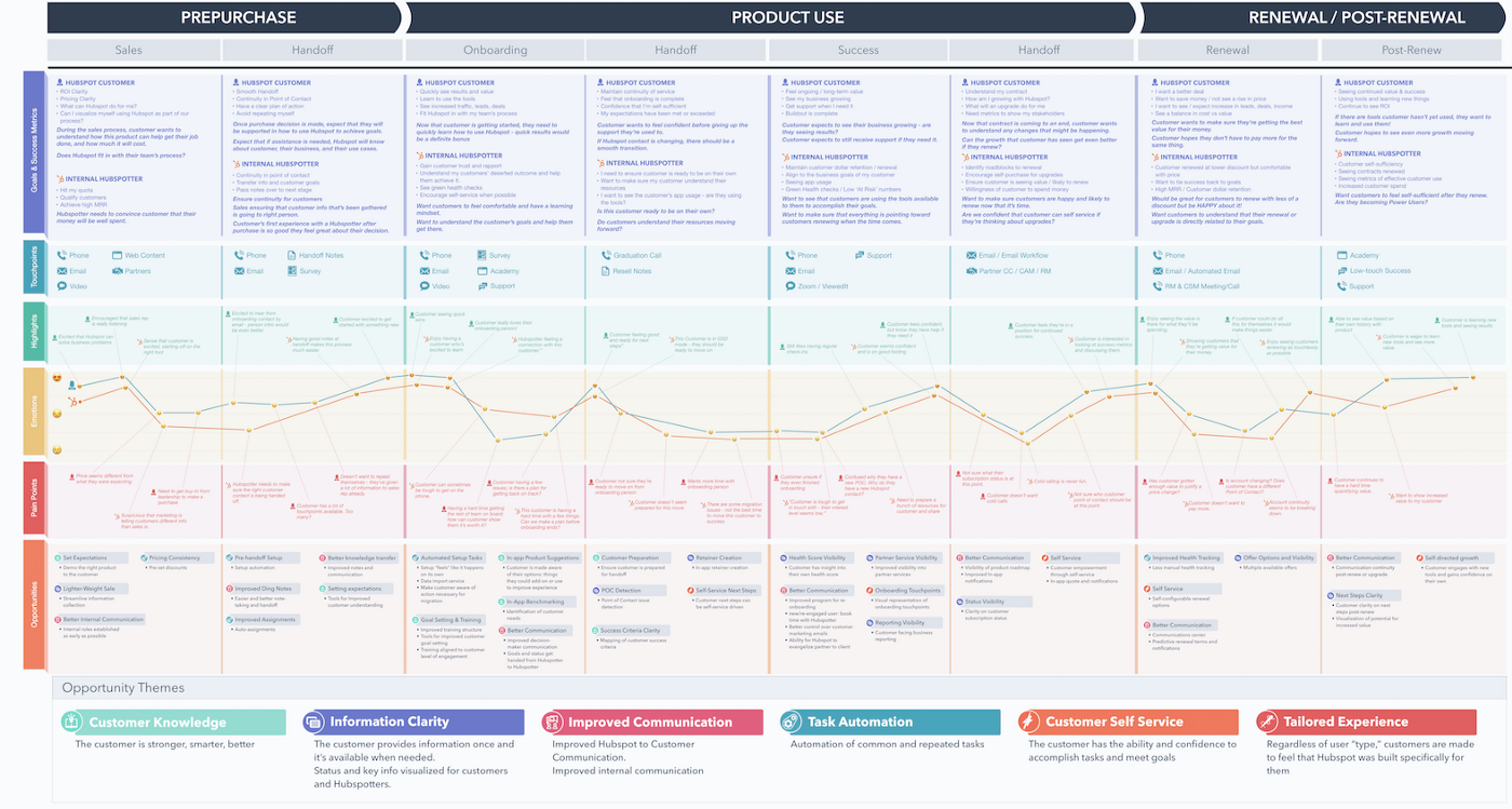
Journey maps are an exercise in telling a user story as they progress through a task or process at a high level. Great journey maps document the triggers and motivators and the post-experience to tell a complete story of a user journey. It breaks down the complex emotions a user may go through to help identify pain-points and opportunities. They are created by conducting workshops with different stakeholders and users through a series of moderated questions and tasks.
Note: Journey maps alone are not enough to tell a story as our user?s journey is often not linear and often times oscillate between phases. There are many other techniques and frameworks out there ? pick the one that maps to your goal and intent.
WIREFRAMES
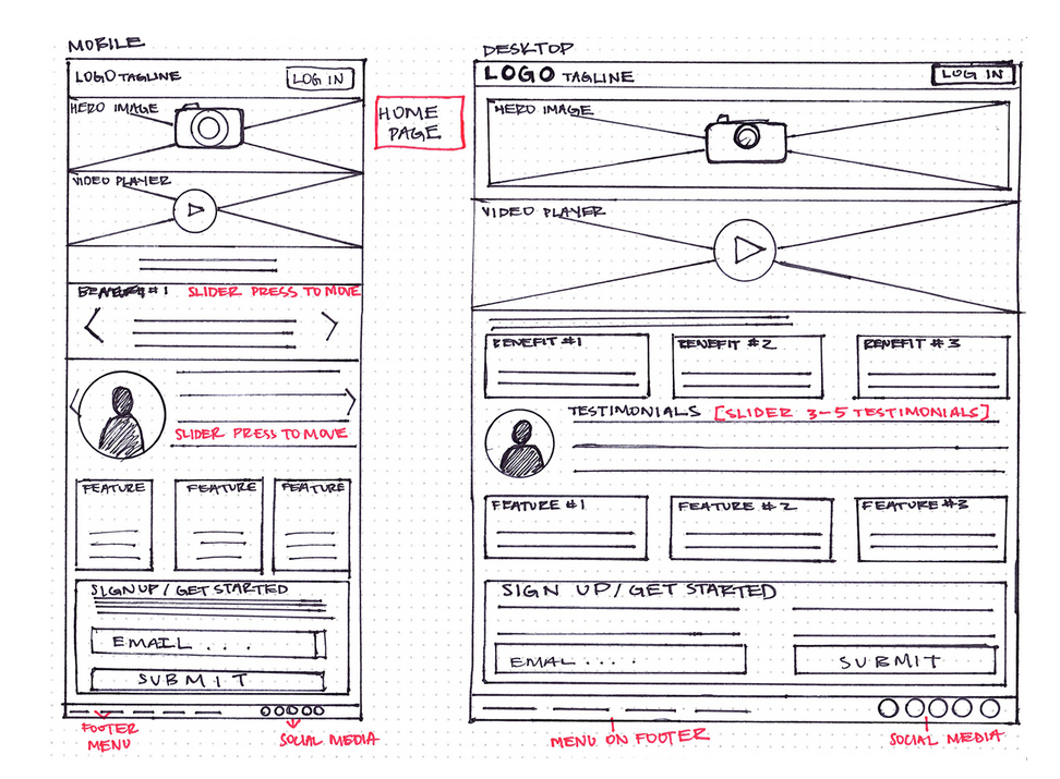
Wireframes are low-fidelity mock-ups to quickly draft solutions for testing and serve as blueprints for higher fidelity designs. Often drafted with paper and pencil, low-fidelity mock-ups are great for ideation because it keeps the investment low. Bad ideas can be quickly scrapped since they are low commitment and cheap, allowing for rapid iterations. It?s a perfect tool for the fail-fast model which can be read about in the Lean UX book (a great book for any budding product designer.)
PROTOTYPES
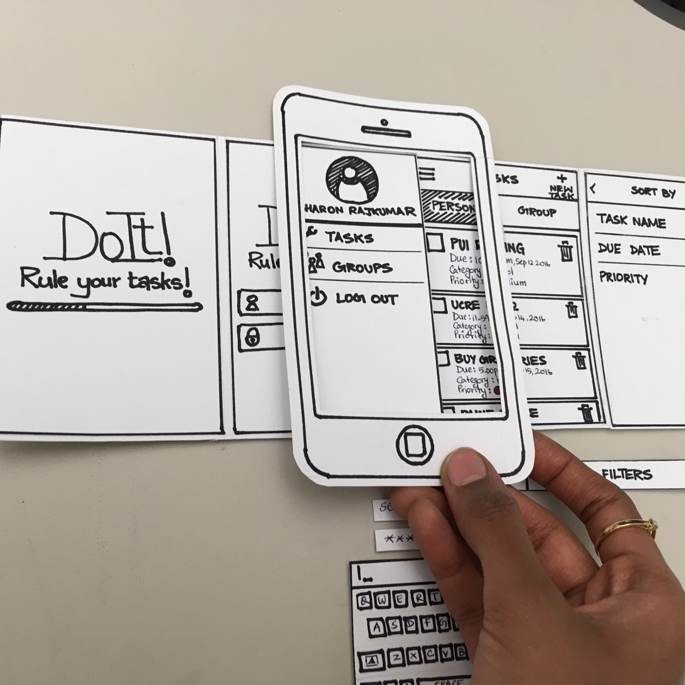
Prototypes are mock-ups created with the purpose of testing. Prototypes can vary in fidelity ? from paper prototypes to simulated, clickable designs. The goal is to test the solution through a series of moderated sessions to gather user feedback. It?s paramount to recruit the correct user segment and to utilize the proper methodology to gather unbiased data. Catching data and issues in the form of information architecture, usability, discoverability etc at this stage will help produce a more user-friendly solution when it is implemented.
HIGH-FIDELITY DESIGNS
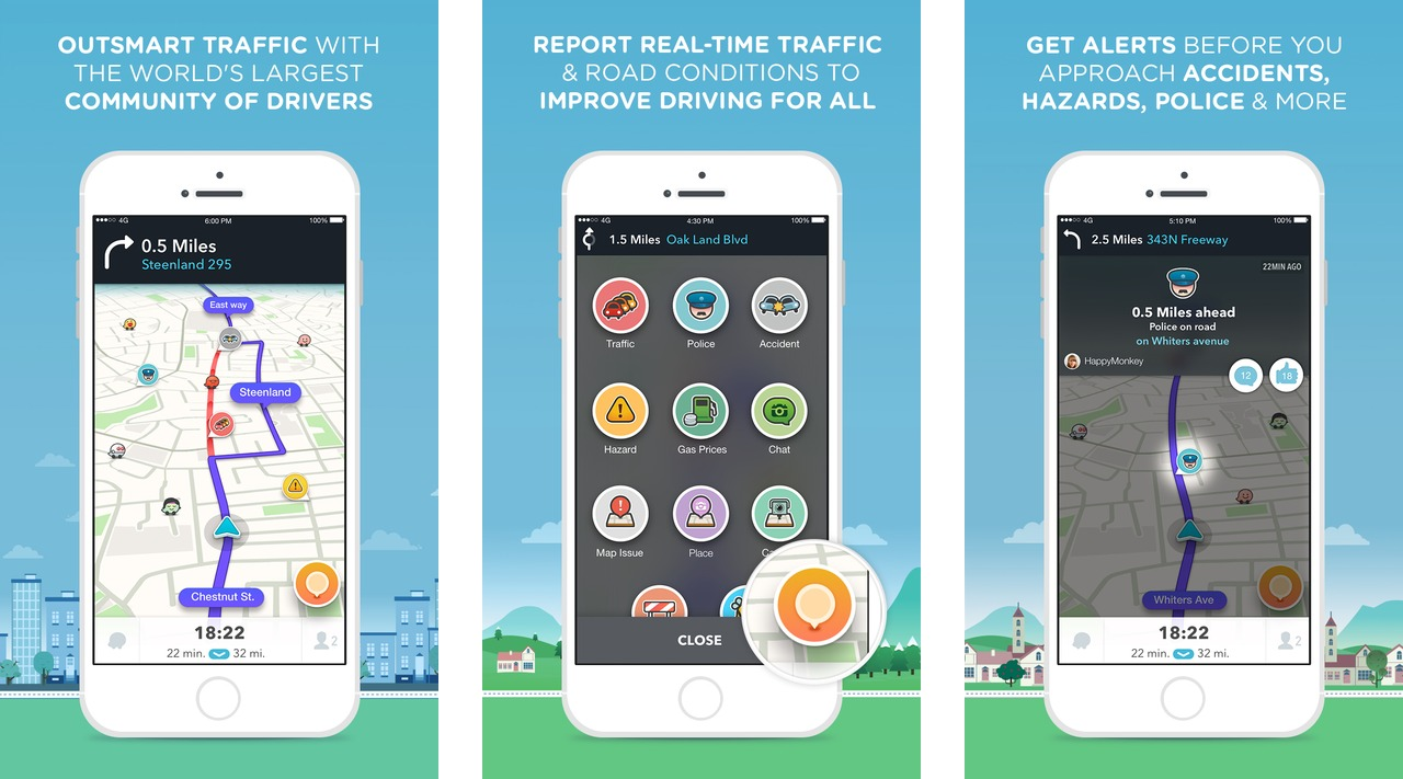
This is the final mock-up of your design. After the solution has been vetted by your users, this design should resemble the final product when it is coded and implemented. These designs serve as the blueprint and guidance for your dev team. They should communicate layout, color, typography, padding and all the fine details down to the last pixel.
These are just a handful of the artifacts and tools a Product Designer employs to solve problems.
We don?t just use design to make things look pretty. We use design to solve problems.
Types of Product Design
There are 3 core types of design when it comes to Product Design:
- System Design
- Process Design
- Interface Design
They all play an integral role in the entire user experience because they all serve a different purpose. Let?s walk through an example.
Design starts with a problem. For our example, let?s say the problem you have is hunger. In our example, the solution you decided to hire to solve your problem is to buy groceries from a grocery store. There are other obvious and not so obvious competitors you can hire to solve your problem. They include:
- Food Delivery
- Restaurants
- Food Trucks
- Convenience Stores
- Vending Machines
- Protein Shakes
- Gaming
- Netflix
- Books
- The Internet
- Sleep
Competition is often something a designer has to consider because you have to create unique value with your solution. For our example, let?s use grocery stores as your solution.
SYSTEM DESIGN
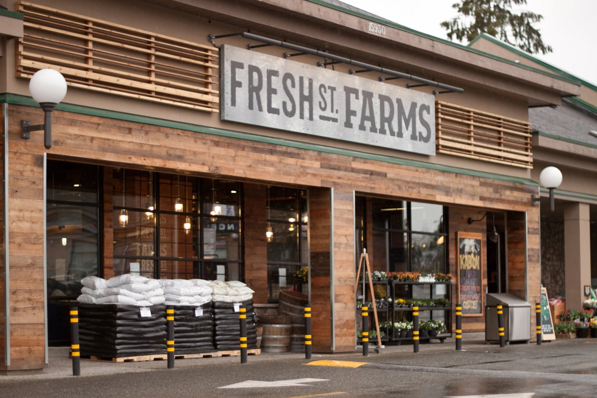
A grocery store is an example of a system design. It is one of many systematic solutions built on the model of exchanging currency for goods. This system provides value by offering the user a vast selection of goods and trades cost for effort since it requires the user to plan, gather and prepare their own food.
While we are here, let?s take a look at some design competencies such as Information Architecture.

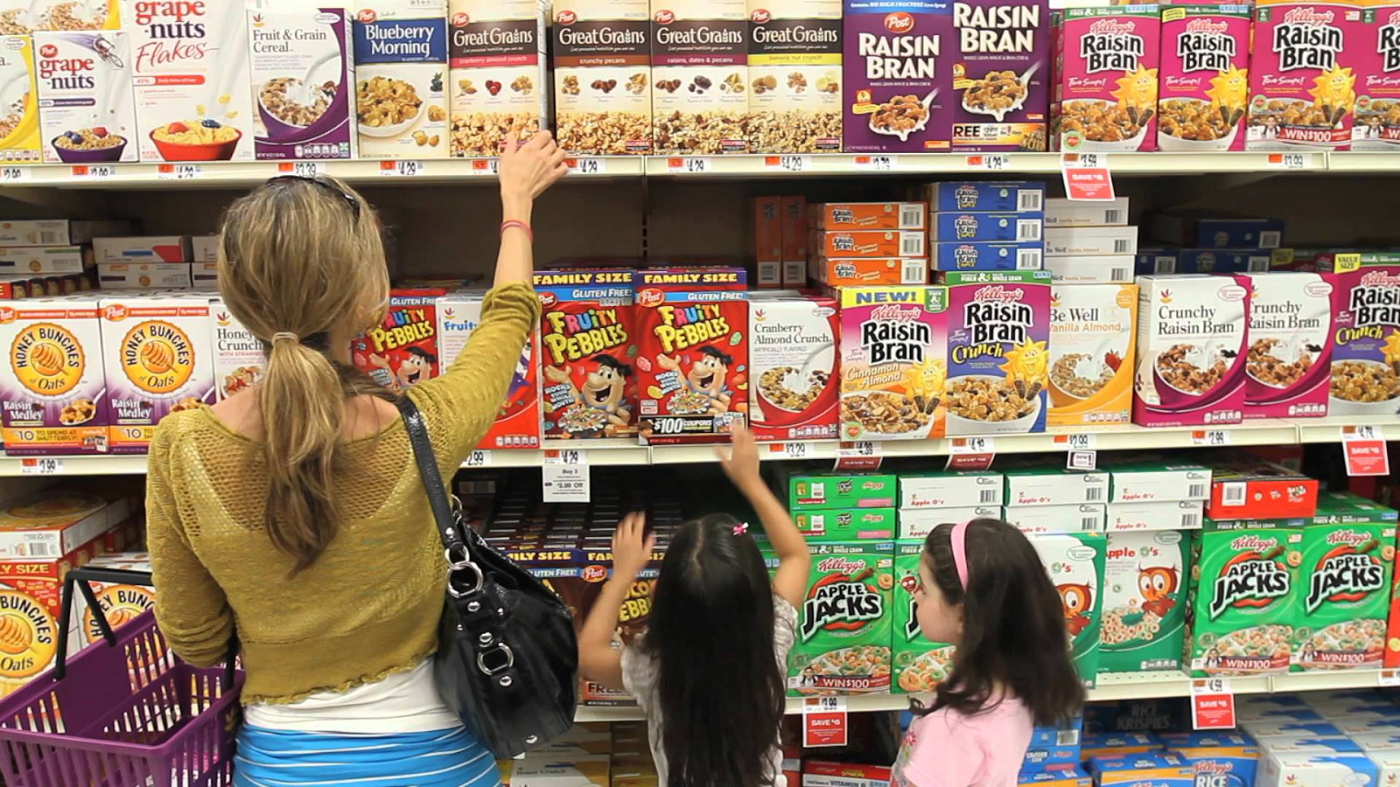
While we don?t notice it most of the time, grocery store aisles are designed to balance business needs and user needs. Items are deliberately organized and placed for affordance to maximize sales. For example, candy may be placed near the entrance during Halloween for easy access and to boost sales. And it may not be a wise choice to place cat food and canned tuna in the same aisle for fear of confusion between the two objects.
Another consideration in your design is the user. Here?s an example you can find in a grocery store. Observe the height of the customers and the placement of the cereal with consideration of business needs (but maybe not the users?).
PROCESS DESIGN

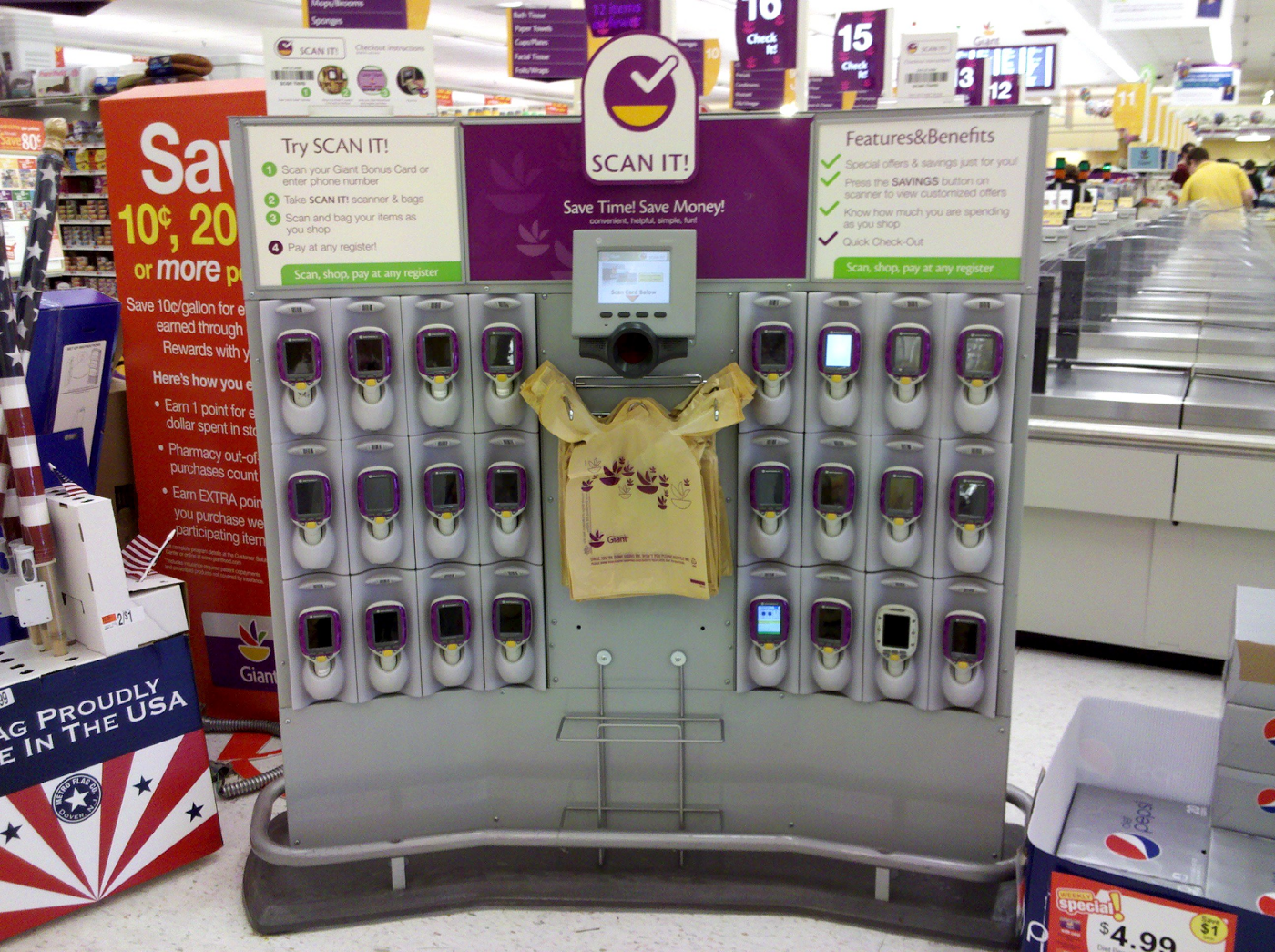
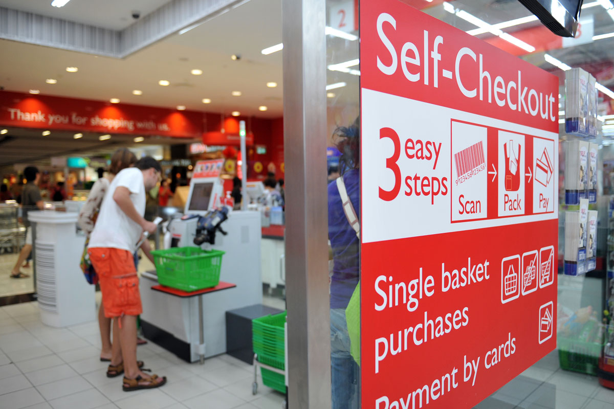
The grocery store acts as a system that gives you the option to choose your foods to take home, there are still processes within the store itself. One of those processes is the transaction where you exchange your money for goods. If you breakdown the process here, the store needs to take a count of what you?re buying and charge you appropriately. In most modern grocery stores there are a several examples of this process.
There is the traditional process where the user waits in line for the grocer to scan their items and conduct the transaction. Another process may involve the user doing a self-scan of their inventory and performing that transaction with a machine. Variables of this process can include a scanner to help expedite the process which lets the user scan items as they add it to their cart.
INTERFACE DESIGN
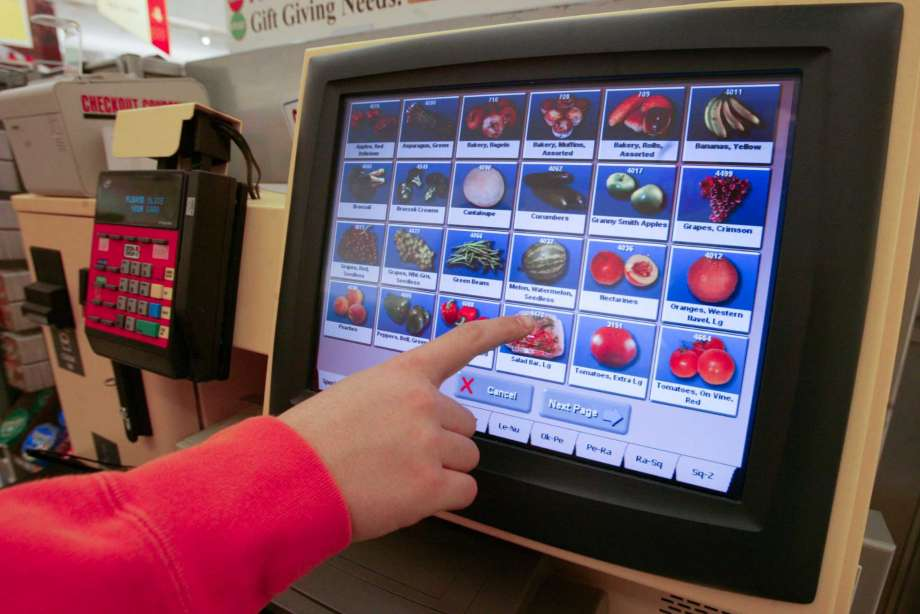
Even in a grocery store, there is interface design for a user to interact with. Whether you are in the assisted checkout line or in a self-checkout line, there is interface for totaling your items and price. In the example above, the self-checkout UI needs to have a level of intuitiveness so a customer can scan all their items, coupons, loyalty card, and enter their payment method.
Breaking down each one of these tasks will reveal the complexities behind each phase of the checkout. For example, what happens if the item doesn?t scan? How does the user find or input the item into the system? How should items be sorted? The design can determine the interface?s usability, reliability, efficiency, and speed.
There are thousands of deliberate decisions that goes into the design of the grocery store system and we see different variations of them from brand to brand. Each decision is designed to smooth out the experience. If these decisions are not made with the intent of making the user experience frictionless, a user will hire a different system to solve their problem such as take-out.

What my day is like
At HubSpot, my day looks very different depending on what phase I am in a project. It can be any combination of the following:
Research our users and problems
This is a significant effort in our process. In order to truly design a solution, we have to be subject matter experts with whom our users are and what problems they?re encountering. We also need to understand their motivations, triggers, aspirations, and goals. We work together with our Product Managers, UX Researchers, Product Insight, and stakeholders to determine our users, verify the problem and determine KPIs.
?If I had one hour to solve a problem, I would spend fifty-five minutes defining the problem, and five minutes on the solution.? ? (Probably) Albert Einstein
Design and prototype
After understanding our users and problems, we start coming up with first drafts of our solution. There are many different methods and workshops for ideating a process ? IDEO curated a great design kit for many of those methods. At HubSpot, we have a design system that allows us to quickly mock-up and prototype a design. This allows us to rapidly test our designs while ensuring a cohesive visual and interactive experience that matches our design principles.
Test with our users
We work closely with our UX Researcher to screen and recruit users to test our designs. Our UX Researchers will help us test our hypothesis by recommending the best testing methodologies. Some of these methods include: Tree Testing, A/B Testing, Surveys, Interviews, and even live Betas.
Design some more
With the feedback and data in our previous step, we use it to inform us on design decisions we should make and change to ensure that our solution is actually solving problems when we launch.
Launch a product
With our final design as a blueprint, our engineering team works in a series of sprints to build our solution. Working closely with the engineers, we go through a series of daily stand-ups and QA to make sure our solution is on track with the design and bug-free.
Measuring and iterating the product
This is the defining moment of Product Design. Designing a user experience is incomplete without measuring and analyzing the data of your product once it?s live. At HubSpot, we work with our UX Research team and our Product Insight team to come up with KPIs that helps us determine the dataset we should be measuring to determine success. Once a product is launched, those numbers are carefully monitored to determine if we are moving the needle and making progress. That data will inform us on any other decisions we need to adjust in the in the next iteration of the design and process.
Product/UX design is this constant loop of analyzing, designing, testing, launching, monitoring, and evolving. All of this is done because we are solving problems.
Do these examples of Product Design make sense? Are there better metaphors? Is there something specific about Product Design you?d want to learn more about? Leave me a comment or tweet at me ? I?d love to hear your thoughts.