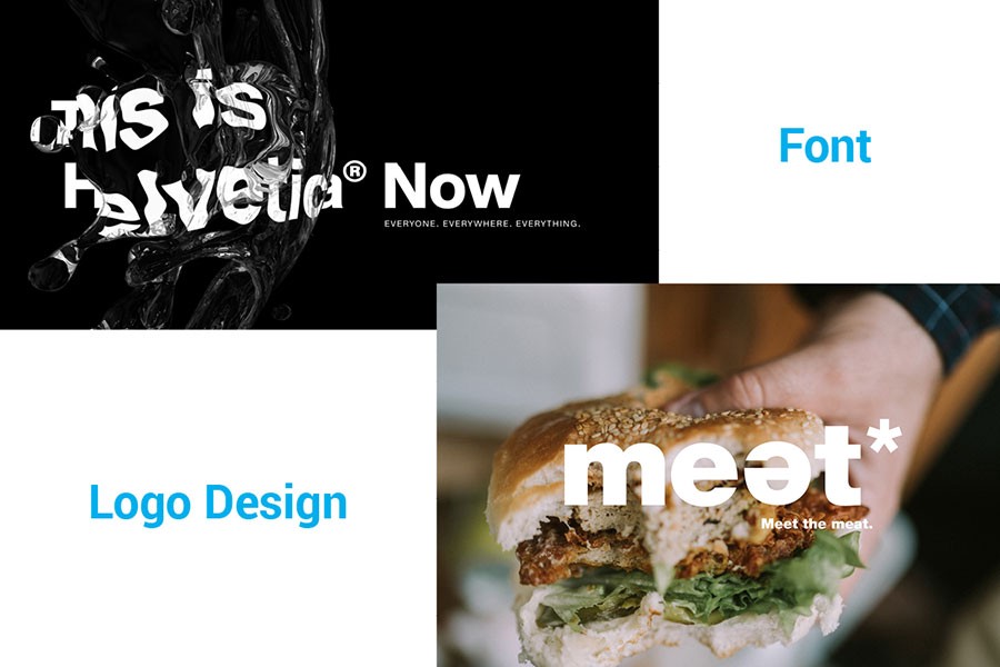
The Helvetica Now family is available in 48 weights from Light Micro to Extra Black Display, with matching italic.
There are many well-known brands that use Helvetica, from the NYC Subway system to corporate giants.
Famous brands that use Helvetica in their logos:
- Panasonic
- Jeep
- American Airlines
Helvetica Now was designed by Max Miedinger, Charles Nix, Monotype Studio, Jan Hendrik Weber and published by Monotype.
Download Helvetica Now font
2. Proxima Nova
Released in 2005, Proxima Nova contains whooping 144 styles and is a complete reworking of the famous Proxima Sans.
Proxima Nova combines geometric appearance with modern proportions.
This extremely popular typeface is often described as a hybrid of Futura and Akzidenz Grotesk.
Here?s an example of Proxima Nova in logo design by Steven Ritchie-Smith.
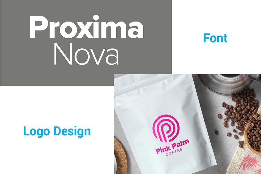
The font-family expanded from just 6 to as many as 48 full-featured OpenType fonts.
Proxima Nova is a mix of humanistic proportions with a somewhat geometric appearance.
Famous brands that use Proxima Nova in their logos:
- Spotify
- Bosh
Proxima Nova was designed and published by Mark Simonson.
This font is also available on Adobe Fonts.
Download Proxima Nova font
3. TT Norms Pro
TT Norms Pro is considered to be one of the bestselling sans ever released.
TT Norms Pro is a geometric sans serif that features classic type character proportions.
TT Norms works equally well both in large text arrays or in headlines and is ?the one?, the indispensable universal font for logo design.
Here?s an example of TT Norms Pro in logo design by Vanderbrand.
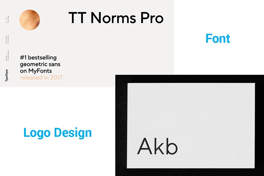
The font family includes 18 reworked fonts, 1392 glyphs in each font, 24 OpenType features and supports more than 216 languages.
TT Norms Pro was designed by Ivan Gladkikh, TypeType Team, Pavel Emelyanov and published by TypeType.
Download TT Norms Pro font
4. FF DIN
FF DIN was created between 1995 and 2009 and despite its primitive, technical appearance, the font quickly became a phenomenon.
Many consider FF DIN the best condensed technical font ever made.
The font works well for packaging, editorial, posters, billboards, way-finding and signage and of course logo & branding.
Here?s an example of FF DIN in logo design by Ruiz+Company.
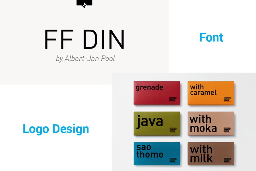
The typeface has pervaded corporate and publication typography and can be seen in posters for cultural institutions.
FF DIN was designed by a dutch designer Albert-Jan Pool and published by FontFont.
Download FF DIN font
5. Avenir Next
Avenir Next Pro is a new take on a classic face, updated so that its technical standards surpass the status quo.
Avenir Next is a linear sans in the tradition of Erbar and Futura.
This family contains styles ranging from ultra-light to heavy, as well as offers condensed faces that rival any other sans on the market in on and off-screen readability.
Here?s an example of Avenir Next font in logo design by Pavels Lavrinovics.
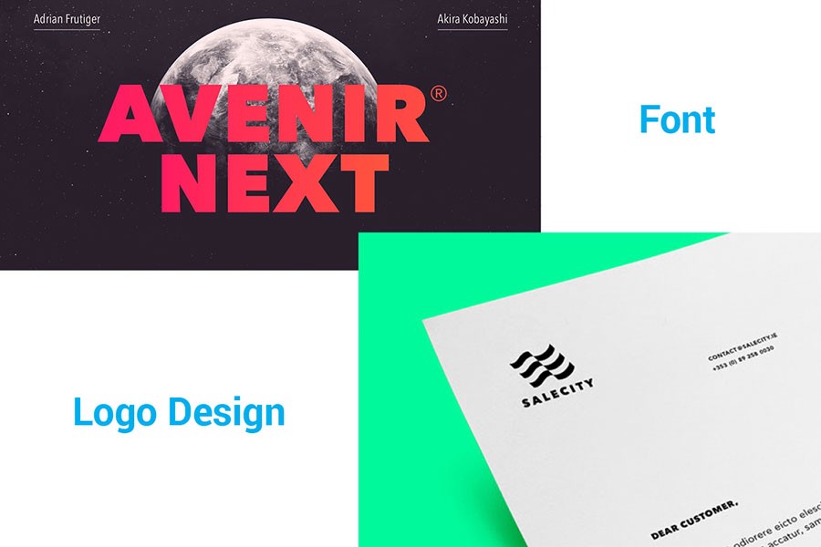
The heavyweights make for excellent display faces in their own right and have the ability to pair well with so many contemporary serif body types.
The word Avenir means ?future? in French, but unlike Futura, Avenir is not purely geometric.
The font has vertical strokes that are thicker than the horizontals, an ?o? that is not a perfect circle, and shortened ascenders.
These nuances aid in legibility and give Avenir a harmonious and sensible appearance for both texts and headlines
Avenir Next was designed by Adrian Frutiger, Akira Kobayashi and published by Linotype.
Akira brought his finesse and ideas to the Frutiger?s original intent, to make not just a modern typeface, but one ahead of its time.
Download Avenir Next font
[Click here to continue reading this article on my blog?] ?
Clap if you liked it ?