Shadowlands Dungeons
Castle Nathria
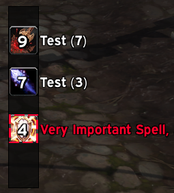
Like with the dungeons, someone does the same for the raid. One of the best in the business is Causese, who has WIP Nathria auras available. Update these when the raid goes live, and like with the Dungeon auras, this should help you with everything. While not a replacement for the lead time that boss mods give you, this makes sure you know exactly what you need to do when you need to do it.
Castle Nathria

Nnoggie?s Raid Ability Timeline Edit
Originally created by PhoGuild?s Joker, Nnoggie does some small upkeep and editing.
This disables DeadlyBossMods or BigWig?s bar display and funnels that information into a timeline instead.

This is more centralized and readable than the usual way, but your mileage may vary.
Raid Ability Timeline Nnoggie Edit
ZenTracker & Nnoggie?s Interrupt Tracker
ZenTracker is an amazing tool ? it tracks interrupts and cooldowns for your group. However, it?s only a back-end ? it requires another WeakAura, a front-end, to work. ZenML has their own icons, bars, and text front-ends, but they can take a lot of setups to get *right*, and you don?t always need to know this info unless you?re a raid leader.
For general use, Nnoggie?s Interrupt Tracker is a favorite front-end ? it?s configured out of the box to track only interrupts. A must-have for Mythic+!

ZenTracker
Nnoggie?s Interrupt Tracker
NOTE: ZenTracker also needs the addon LibGroupInSpecT to work ? simply install like any other.
https://www.curseforge.com/wow/addons/libgroupinspect
Ultimate Mouse Cursor
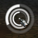
This one is less important, but I find it hard to track my mouse cursor as a healer when moving the camera a lot. It puts a series of circles around your cursor in combat, one to track current cast time, one to track your GCD, and one that?s always there so you can see it. I?ll also share my edit of size/color ? I wanted something less intrusive but with the same functionality.


Ultimate Mouse Cursor
Our Edit ? It?s a lot smaller and is a more visible red.
Troubleshooting
Set UI Scale to 0.53 (for Small) or 0.74 (for Large) if everything seems to be in the wrong place.
Type /moveui or click Toggle Anchors in the ElvUI settings to reposition anything you?d like otherwise.If there?s something that isn?t showing up that you think should, or any tweaks you?d like to make, it?s worth getting into editing our own UI and WeakAuras ? it?s a fun rabbit hole! Any pressing questions, you can ask @Plasmagi on Twitter.
Rationale
Actionbars are center screen because that?s what you need to know more often than anything else. Player buffs are similarly important, so are just offset to the left. Player health is relatively large and well away from the center ? you can see how full the bar is in the periphery. The pitch-black backdrop helps provide contrast against the class color.
Enemy status should mostly be handled by Nameplates, but the Target Frame also displays debuff bars so you can follow those easily.
The top-left/left is mostly kept clear, as room for additional information from WeakAuras or things like raid assignments.
The same goes for the right. There?s room between the center and boss frames to allow for boss mod addon or WeakAura info.
Party and raid are designed to take up minimal space and have only the most basic information ? ElvUI?s filters handle showing only the buffs/debuffs you need to see, as well as anything you can handle yourself.
The minimap has been set larger and the likes of experience, honor and reputation are up there, as is system info and time. Having key information at a glance is useful, so might as well put it all in the same already-used spot.